
Objective:
Use the Difference-in-Differences (DiD) framework to estimate the impact of COVID-19 lockdowns on air pollution (\(NO_2\)).
In March 2020, counties across the United States responded to the start of what would be the COVID 19 Pandemic. While every state faced the same biological threat, governors responded with vastly different mandates. Some states, like California and New Mexico, implemented strict “Stay at Home” orders early on. Others, like Arizona and Texas, opted for more relaxed restrictions, allowing businesses like golf courses and salons to remain open longer.In this lab, we will use a Difference-in-Difference (DiD) framework to isolate the impact of these varying lockdown levels. By comparing “strict” counties to their more “relaxed” neighbors, we can determine if the severity of the lockdown had a measurable impact on \(NO_2\) levels— a key indicator of vehicle traffic and urban activity.
DiD # 1: Los Angeles, CA vs Phoenix, AZ
In this scenario, we compare two major Southwestern hubs that faced very different lockdown mandates in March 2019: Los Angeles, CA and Phoenix, AZ.
On March 19th, 2020, California Governor Gavin Newsom issued a Statewide shelter in place order. Phoenix, AZ did not start their lockdown until March 31, 2020. The strictness of the lockdown varied from city to city. In Arizona, hair salons and golf courses were allowed to stay open, while Los Angeles had a stricter lockdown order that did not permit such businesses to operate.
We will use these varying lockdown levels to see if the severity/ strictness of the lockdown had an impact on NO2 levels.
- Outcome (\(Y\)): Nitrogen Dioxide (\(NO_2\)), which is primarily produced by vehicle traffic
- Treatment Group: Los Angeles (Early, strict lockdown)
- Control Group: Phoenix (Later, shorter lockdown)
The Question: Can we use Phoenix as a “mirror” for what would have happened in LA without a lockdown?
library(tidyverse)
library(janitor)
library(lubridate)
About the Data
Data Source
Air quality data for this analysis was obtained from the U.S. Environmental Protection Agency’s (EPA) Outdoor Air Quality Data portal. The dataset includes daily measurements of nitrogen dioxide (NO2) concentrations from monitoring stations in Los Angeles, California and Phoenix, Arizona.
Read in LA and Phoenix EPA Data
LA_2019 <- read_csv(here::here("week3" ,"data",  "LA_2019.csv")) %>%
  filter(`Local Site Name` == "West Los Angeles") %>% mutate(city = "LA", year = 2019)


LA_2020 <- read_csv(here::here("week3" ,"data", "LA_2020.csv")) %>%
  filter(`Local Site Name` == "West Los Angeles") %>% mutate(city = "LA", year = 2020)

Phoenix_2019 <- read_csv(here::here("week3" ,"data", "phoenix_2019.csv")) %>%
  filter(`Local Site Name` == "WEST PHOENIX") %>%
  mutate(city = "Phoenix", year = 2019)

Phoenix_2020 <- read_csv(here::here("week3" ,"data", "phoenix_2020.csv")) %>%
  filter(`Local Site Name` == "WEST PHOENIX") %>%
mutate(city = "Phoenix", year = 2020)

# Combine all into one master data frame
did_data_az_ca <- bind_rows(LA_2019, LA_2020, Phoenix_2019, Phoenix_2020) %>% clean_names()
Parallel Trends
A DiD is only valid if the Treatment and Control groups were moving in the same direction before the intervention hit. Let’s see if we pass the parallel trends assumption.
weekly_la_phx <- did_data_az_ca %>%
  mutate(
    date_obj = mdy(date),
    week = floor_date(date_obj, unit = "week")
  ) %>%
  filter(year == 2020, month(date_obj) %in% c(2, 3, 4)) %>%
  group_by(week, city) %>%
  summarize(
    mean_no2 = mean(daily_max_1_hour_no2_concentration, na.rm = TRUE),
    .groups = "drop"
  )

# Create line plot of phx and LA
ggplot(weekly_la_phx, aes(x = week, y = mean_no2, color = city)) +
  geom_line(size = 1.2) +
  geom_point(size = 2.5) +

  # Add CA lockdown start date dashed line
  geom_vline(xintercept = as.Date("2020-03-19"), linetype = "dashed", color = "gray30", size = 1) +

  # Add CA lockdown start date label
  annotate("label", x = as.Date("2020-03-20"), y = 30,
           label = "CA Lockdown \n Starts", hjust = 0, size = 3) +

  labs(
    title = "Weekly NO2 Trends in 2020: Los Angeles vs. Phoenix",
    x = "Date",
    y = "Weekly Avg NO2 (ppb)",
    color = "City"
  ) +
  theme_minimal() +
  scale_color_brewer(palette = "Set1")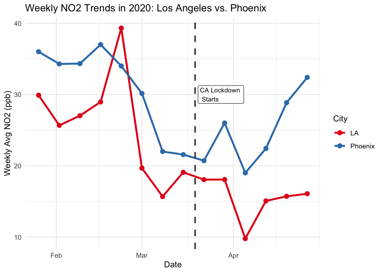
Tip
Look at the lines before the dashed vertical line. Are they moving together? If Phoenix is rising while LA is falling (or vice versa) before the lockdown, can we truly blame the lockdown for the difference we see afterward?
DiD # 2: Dona Ana County, NM and El Paso County, TX
To improve our study, we will look at two counties that share a border: Dona Ana County, NM (Treated) and El Paso County, TX (Control). Because they share the same desert air and weather patterns, El Paso is a much “cleaner” control group for Dona Ana.
- Outcome (\(Y\)): Nitrogen Dioxide (\(NO_2\)), which is primarily produced by vehicle traffic
- Treatment Group: Dona Ana County, NM (Early, strict lockdown)
- Control Group: El Paso County, TX (Later, shorter lockdown)
We will start with reading in our New Mexico/ Texas data, and checking the parallel trends assumption for these two counties.
NM_2019 <- read_csv(here::here("week3", "data", "nm_2019.csv")) %>% mutate(state = "NM", year = 2019,
      `County FIPS Code`  = as.numeric(`County FIPS Code`))

NM_2020 <- read_csv(here::here("week3", "data", "nm_2020.csv")) %>%  mutate(state = "NM", year = 2020,                       `County FIPS Code`  = as.numeric(`County FIPS Code`))

TX_2019 <- read_csv(here::here("week3", "data", "tx_2019.csv")) %>%
  mutate(state = "TX", year = 2019)

TX_2020 <- read_csv(here::here("week3", "data", "tx_2020.csv")) %>%
  mutate(state = "TX", year = 2020)


# Combine all into one master data frame
did_data_nm_tx <- bind_rows(NM_2019, NM_2020, TX_2019, TX_2020) %>% clean_names()
DiD # 2: Parallel Trends Assumption
did_weekly <- did_data_nm_tx %>%
  mutate(
    date_obj = mdy(date),
    week = floor_date(date_obj, unit = "week")
  ) %>%

  filter(year == 2020, month(date_obj) %in% c(2, 3, 4)) %>%
  group_by(week, state) %>%
  summarize(
    mean_no2 = mean(daily_max_1_hour_no2_concentration, na.rm = TRUE),
    .groups = "drop"
  )

ggplot(did_weekly, aes(x = week, y = mean_no2, color = state)) +

  geom_line(size = 1.2) +

  geom_point(size = 3) +

  # Vertical line for the NM Lockdown (March 23, 2020)
  geom_vline(xintercept = as.Date("2020-03-23"), linetype = "dashed", color = "gray30", size = 1) +
  annotate("label", x = as.Date("2020-03-24"), y = 35, label = "NM Lockdown Starts", hjust = 0, size = 2.5) +
  labs(
    title = "Weekly 2020 NO2 Trends: NM vs TX",
    x = "Date",
    y = "Weekly Avg NO2 (ppb)",
    color = "State"
  ) +
  theme_minimal() +
  scale_color_brewer(palette = "Set1")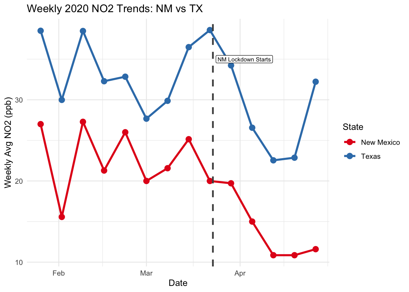
Notice how much more “in sync” these two lines are compared to LA and Phoenix. Why is a border comparison (same weather, same air) usually considered “cleaner” than comparing two distant cities?
Getting ready for DiD
In order to include treatment and time as part of our DiD, we need to create dummy variables for them. We will create a variable treated that will be = 1 for New Mexico (the “treated” group in our scenario will be a stricter lockdown), and will be = 0 for Texas (the “control” group in our scenario will be the more relaxed lockdown.)
Our is_post variable will denote weather or not the observation is after the intervention (in this case, the start of the lockdown in New Mexico.). is_post will = 0 for observations before March 23,2020, and will = 1 for observations after March 23, 2020.
did_data_nm_tx <- did_data_nm_tx %>%
  mutate(
    date_obj = mdy(date),
    #treatment = NM, control = TX
    treated = ifelse(state == "New Mexico", 1, 0),

    # Post = after Mar 23
    is_post = ifelse(date_obj >= as.Date("2020-03-23"), 1, 0)
  )
Estimating the treatment effect
The simplest form of estimating the treatment effect can be denoted by :
\((Y_{\text{treat, post}} - Y_{\text{treat, pre}}) - (Y_{\text{control, post}} - Y_{\text{control, pre}})\)
Another way to estimate DiD (and the way we will often use in this course), is to use regression.
\[y = \beta_0 + \beta_1 \cdot \text{treat} + \beta_2 \cdot \text{year} + \beta_3 \cdot (\text{treat} \times \text{year})\]
Let’s start by manually calculating the treatment effect using the first formula.
y_trt_post <- did_data_nm_tx %>% filter(treated == 1, is_post  == 1, year == 2020,  month(date_obj) %in% c(2, 3, 4)) %>%
  summarise(mean(daily_max_1_hour_no2_concentration)) %>% pull()

y_trt_pre <- did_data_nm_tx %>% filter(treated == 1, is_post  == 0, year == 2020,  month(date_obj) %in% c(2, 3, 4)) %>%
  summarise(mean(daily_max_1_hour_no2_concentration)) %>% pull()

y_con_post <- did_data_nm_tx %>% filter(treated == 0, is_post  == 1, year == 2020,  month(date_obj) %in% c(2, 3, 4)) %>%
  summarise(mean(daily_max_1_hour_no2_concentration)) %>% pull()

y_con_pre <- did_data_nm_tx %>% filter(treated == 0, is_post  == 0, year == 2020,  month(date_obj) %in% c(2, 3, 4)) %>%
  summarise(mean(daily_max_1_hour_no2_concentration)) %>% pull()

trt_effect <- (y_trt_post- y_trt_pre) - (y_con_post - y_con_pre)

print(paste("The treatment effect is", round(trt_effect,4)))
[1] "The treatment effect is -3.5162"Now, lets use a regression to estimate our treatment effect and see if we get a similar result!
\[y = \beta_0 + \beta_1 \cdot \text{treat} + \beta_2 \cdot \text{year} + \beta_3 \cdot (\text{treat} \times \text{year})\]
tx_nm_did <- lm(daily_max_1_hour_no2_concentration ~ treated * is_post,
                 data = filter(did_data_nm_tx, year == 2020, month(date_obj) %in% c(2, 3, 4) ))

summary(tx_nm_did)
Call:
lm(formula = daily_max_1_hour_no2_concentration ~ treated * is_post,
    data = filter(did_data_nm_tx, year == 2020, month(date_obj) %in%
        c(2, 3, 4)))

Residuals:
    Min      1Q  Median      3Q     Max
-26.019  -5.821  -0.280   6.512  20.681

Coefficients:
                Estimate Std. Error t value Pr(>|t|)
(Intercept)       32.863      1.314  25.003  < 2e-16 ***
treated          -10.583      1.868  -5.665 6.06e-08 ***
is_post           -3.943      2.043  -1.930   0.0553 .
treated:is_post   -3.516      2.863  -1.228   0.2210
---
Signif. codes:  0 '***' 0.001 '**' 0.01 '*' 0.05 '.' 0.1 ' ' 1

Residual standard error: 9.386 on 172 degrees of freedom
Multiple R-squared:  0.3488,    Adjusted R-squared:  0.3374
F-statistic: 30.71 on 3 and 172 DF,  p-value: 5.978e-16
TipComprehension Check
What does this treatment effect of -3.5 mean? Talk with a partner!
Warning
Does our 2020 data tell the whole story? What if the drop we were experiencing in NO2 were due to seasonal trends, and were bound to happen with or without a lockdown?
Discussion Questions:
Before the lockdown, we see week-to-week fluctuations in NO2 in New Mexico and Texas. Do you think that Texas make a compelling counterfactual which satisfies the main causal identification assumption for DiD?
Look at your summary(tx_nm_did) output. Which specific coefficient represents the “Treatment Effect” (the actual impact of the lockdown)? Is this coefficient statistically significant at the 5% level (\(p < 0.05\))? Explain what that \(p\)-value tells us about the relationship between the lockdown and \(NO_2\).
The DiD framework relies on a “Counterfactual”—the idea of what would have happened to New Mexico if it hadn’t locked down. In this lab, what serves as our counterfactual? If a massive dust storm hit both El Paso and Dona Ana on March 25th, would that ruin our DiD estimate? Why or why not? (Hint: Think about whether the storm affects both groups equally).
Government mandates (lockdowns) are the “Treatment,” but the actual “Cause” of lower \(NO_2\) is fewer cars on the road. If people in El Paso (the “Control” group) got scared and stayed home just as much as people in New Mexico (the “Treated” group) despite the lack of a legal mandate, what would happen to our DiD estimate? Would it get larger or smaller?